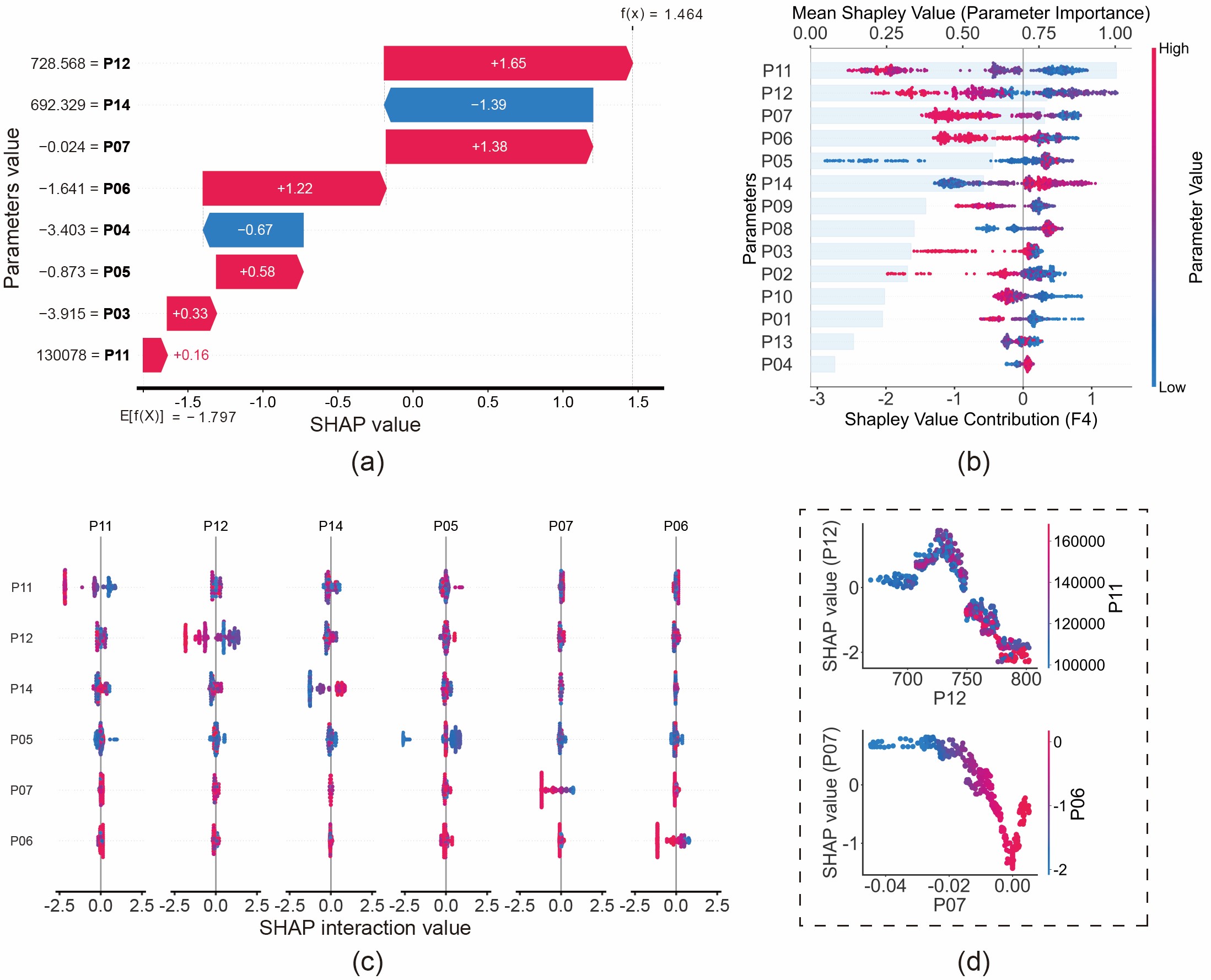
若您對上述圖表的實現細節感興趣,以下是用於生成瀑布圖、蜂群圖、交互圖和依賴圖的範例代碼。👇
import shap
import matplotlib.pyplot as plt
import numpy as np

# --- 0. Setup & Global Settings ---
plt.rcParams['font.family'] = 'Arial'
plt.rcParams['font.size'] = '24'
plt.rcParams['axes.unicode_minus'] = False

# Assumption: 'best_model' is your trained XGBoost/RF model
# Assumption: 'X_train' and 'X_test' are pandas DataFrames

# 1. Calculate SHAP values as Numpy Arrays (for Beeswarm, Dependence, Interaction)
explainer_tree = shap.TreeExplainer(best_model)
shap_values_numpy = explainer_tree.shap_values(X_train)

# 2. Calculate SHAP values as Explanation Object (Specifically for Waterfall)
explainer_obj = shap.Explainer(best_model, X_test)
shap_values_obj = explainer_obj(X_test)


##################################################################
#                                                                #
#                      (a) Waterfall Plot                        #
#          Visualizes contribution for a single sample           #
#                                                                #
##################################################################

class_idx = 4  # Target class
sample_idx = 3 # Specific sample to explain

plt.figure()
shap.plots.waterfall(
    shap_values_obj[sample_idx, :, class_idx],
    max_display=9,
    show=False
)

# Customizing style
ax = plt.gca()
ax.set_xlabel(ax.get_xlabel(), fontsize=36)
ax.set_ylabel(ax.get_ylabel(), fontsize=36)
ax.spines['bottom'].set_linewidth(3)
plt.show()


##################################################################
#                                                                #
#                      (b) Beeswarm Plot                         #
#              Global summary of feature importance              #
#                                                                #
##################################################################

class_idx = 5
plt.figure(figsize=(10, 8))

shap.summary_plot(
    shap_values_numpy[..., class_idx],
    X_train,
    feature_names=X_train.columns,
    plot_type="dot",
    show=False,
    cmap='Greys' # or 'plasma'
)

# Customize Color Bar
cbar = plt.gcf().axes[-1]
cbar.set_ylabel('Parameter Value', fontsize=24)
cbar.tick_params(labelsize=20)
plt.show()


##################################################################
#                                                                #
#                     (c) Interaction Plot                       #
#          Visualizes interaction effects between features       #
#                                                                #
##################################################################

# Note: Calculation can be expensive
shap_interaction_values = explainer_tree.shap_interaction_values(X_test)
class_idx = 4

plt.figure()
shap.summary_plot(
    shap_interaction_values[..., class_idx],
    X_test,
    show=False,
    max_display=6,
    cmap='Greys'
)

# Clean up subplots
axes = plt.gcf().axes
for ax in axes:
    ax.spines['bottom'].set_linewidth(2)
    ax.tick_params(axis="x", labelsize=18, width=2)
    ax.set_title(ax.get_title(), fontsize=14)

plt.subplots_adjust(wspace=0.3, hspace=0.4)
plt.show()


##################################################################
#                                                                #
#                     (d) Dependence Plot                        #
#           Feature relationship colored by interaction          #
#                                                                #
##################################################################

Feature_X = 'P06'  # Main feature
Feature_Y = 'P07'  # Interaction feature
class_idx = 4

shap.dependence_plot(
    Feature_X,
    shap_values_numpy[..., class_idx],
    X_train,
    interaction_index=Feature_Y,
    dot_size=100,
    show=False
)

# Customize Axes
ax = plt.gca()
ax.tick_params(axis='both', which='major', labelsize=36, width=2)
ax.set_ylabel(f'SHAP value ({Feature_X})', fontsize=36)
ax.spines['bottom'].set_linewidth(3)
ax.spines['left'].set_linewidth(3)
plt.show()


##################################################################
#                                                                #
#            (e) Advanced Composite Plot (Beeswarm + Bar)        #
#      Combines Beeswarm (Bottom Axis) & Importance (Top Axis)   #
#                                                                #
##################################################################

class_idx = 5
fig, ax1 = plt.subplots(figsize=(10, 8))

# 1. Main Beeswarm Plot (on ax1)
shap.summary_plot(
    shap_values_numpy[..., class_idx],
    X_train,
    feature_names=X_train.columns,
    plot_type="dot",
    show=False,
    color_bar=True,
    cmap='Greys' # or 'plasma'
)

# Customize Color Bar
cbar = plt.gcf().axes[-1]
cbar.set_ylabel('Parameter Value', fontsize=24)
cbar.tick_params(labelsize=20)

# Adjust layout to make room for the top axis
plt.gca().set_position([0.2, 0.2, 0.65, 0.65])

# 2. Feature Importance Bar Plot (on Top Axis ax2)
# Create a twin axis sharing the y-axis
ax2 = ax1.twiny()

shap.summary_plot(
    shap_values_numpy[..., class_idx],
    X_train,
    plot_type="bar",
    show=False
)

# Align position with the main plot
plt.gca().set_position([0.2, 0.2, 0.65, 0.65])

# Style the bars (Transparent & Light Color)
bars = ax2.patches
for bar in bars:
    bar.set_color('#CCE5FB') # Light blue background bars
    bar.set_alpha(0.4)       # Transparency

# Customize Axes Labels
ax1.set_xlabel(f'Shapley Value Contribution (F{class_idx})', fontsize=24, labelpad=5)
ax1.set_ylabel('Parameters', fontsize=24)
ax2.set_xlabel('Mean Shapley Value (Parameter Importance)', fontsize=24, labelpad=10)

# Move ax2 (Bar plot axis) to the top
ax2.xaxis.set_label_position('top')
ax2.xaxis.tick_top()

# Ensure ax1 (dots) is drawn ON TOP OF ax2 (bars)
ax1.set_zorder(ax1.get_zorder() + 1)
ax1.patch.set_visible(False) # Make ax1 background transparent

plt.show()